Best-in-breed BI tools, like Tableau, have excellent geospatial visualization for small and manageable data sets. They pull down your data from the source and use client-side technologies to deliver an interactive data exploration experience. But when you have hundreds of thousands, or even millions of data points, modern BI tools simply can't visualize data at the scale demanded, due to the natural limitations of client-side rendering.
Kinetica Geospatial Visualization for Tableau, a brand new extension from Kinetica, changes the game, giving you visualization at virtually unlimited scale for geospatial data in Tableau. Instead of shipping data down from your data warehouse, the extension uses Kinetica's Web Map Service (WMS) endpoint to leverage server-side rendering. This creates visualizations on massive datasets in real time — transforming your data into a small image layer on top of a basemap. With every pan and zoom on the map, Kinetica dynamically renders images on your live data source and sends them to the map.
The result is impossibly fast geospatial visualization in Tableau that scales to millions of data points with ease.
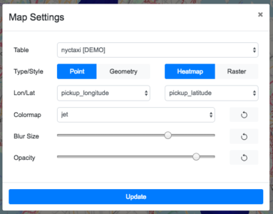
Kinetica Geospatial Visualization for Tableau gives you the ability to customize the way your geospatial data is displayed. You can choose from two rendering modes: Heatmap and Raster. In Heatmap mode, geospatial data is displayed in terms of its density on the map. In Raster mode, each point or polygon is given a solid color, so you can see each and every individual shape on the map. Changing the color, the blur, and other visualization parameters is easy — you use only dropdowns and sliders to change the look and feel. If your data has multiple columns with geospatial data in it, you can easily switch between them as needed.
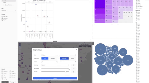
By using the extension in conjunction with Kinetica's JDBC connector, you can accelerate your entire BI experience. You'll be able to create stunning dashboards with all of your favorite Tableau charts, backed by massive data sets, with geospatial data now included. As you apply filters in your dashboard, the map instantly updates to reflect changes on the fly. Kinetica takes care of creating the views for you under the hood, giving you real-time interactivity when slicing and dicing huge data sets.
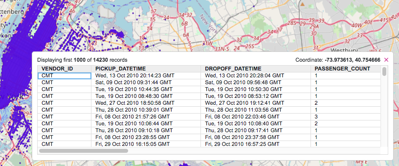
Drilling into map data is easy too. Simply click anywhere on the map, and see a tabular view of all the data near your point of interest. The extension will automatically paginate the results, so you get a snappy response and a reasonable amount of data returned for you to explore.
With Kinetica Geospatial Visualization for Tableau, you can gain real-time visibility of geospatial assets in time and space, and conduct historical forensic analysis at a scale not previously possible in Tableau. Kinetica gives you the ability to trace the routes taken by your GPS-enabled devices, so you can understand where your assets are in real time, whether they're electric scooters or shipping containers. Want to see where major bottlenecks occur along road networks? Kinetica's heatmap can show you areas of high traffic, helping you make better decisions when route planning.
To learn more about the extension, read our documentation, where you'll find instructions on how to install and configure the extension in Tableau. If you don't have a Kinetica license yet, try out the extension using the embedded demo mode to experience the scale and ease of use for yourself.
Matt Brown is lead product manager at Kinetica.